Case Study: Origin at Cello Tower
Developer: Red Ridge Development
Architecture: Perkins Eastman
Interior design: One Line Design
Landscape design: Floor Associates
Marketing: Wicked
Project website: originatsymphonypark.com
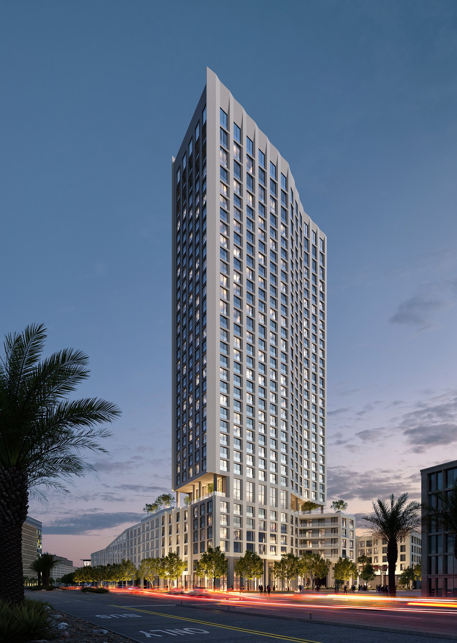
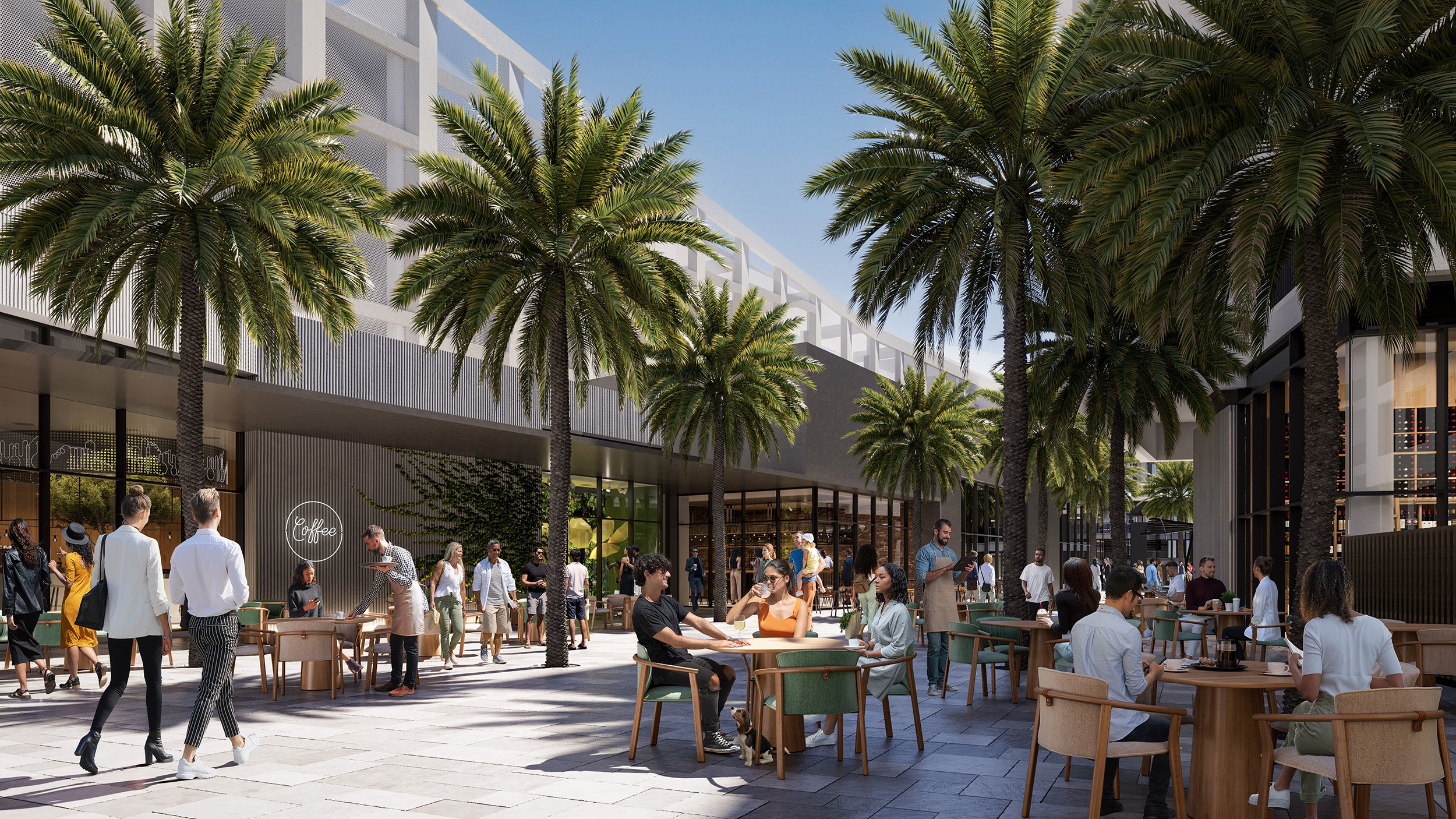
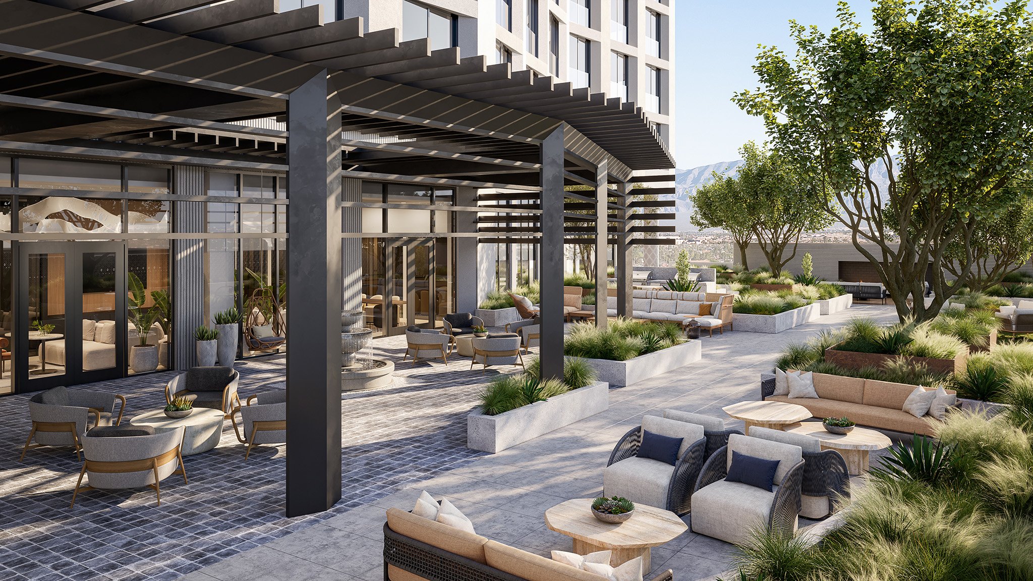
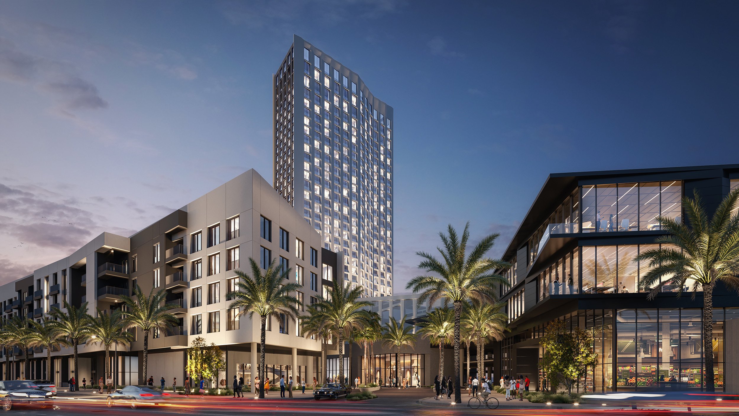
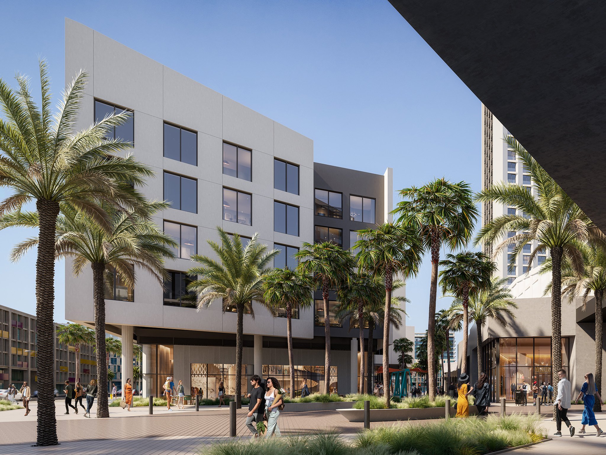
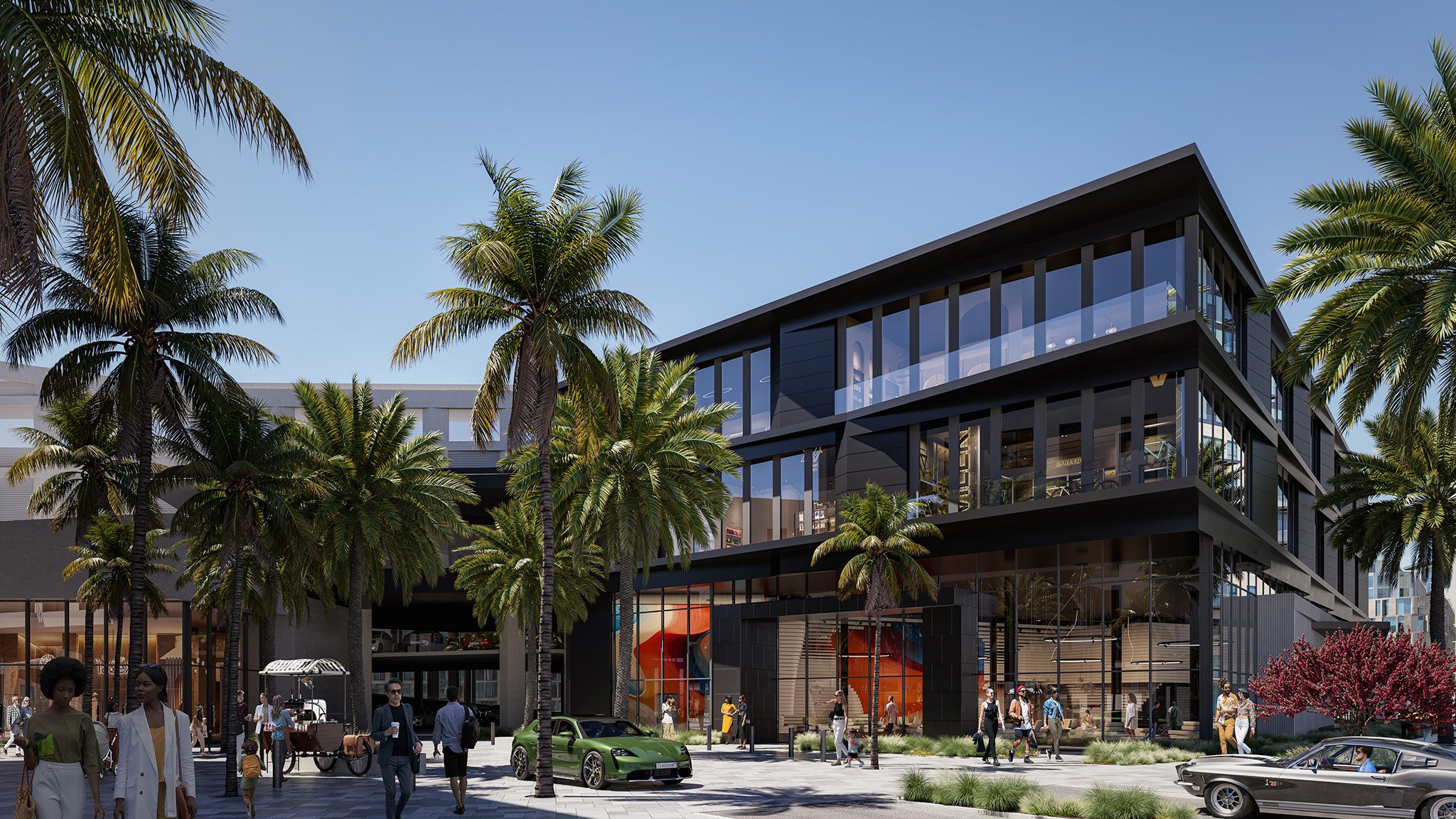
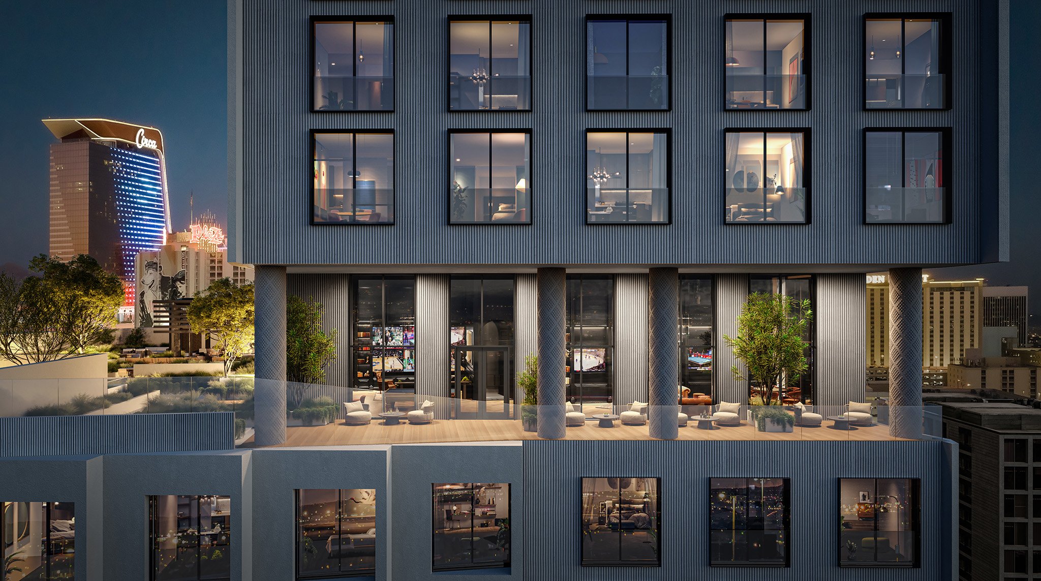
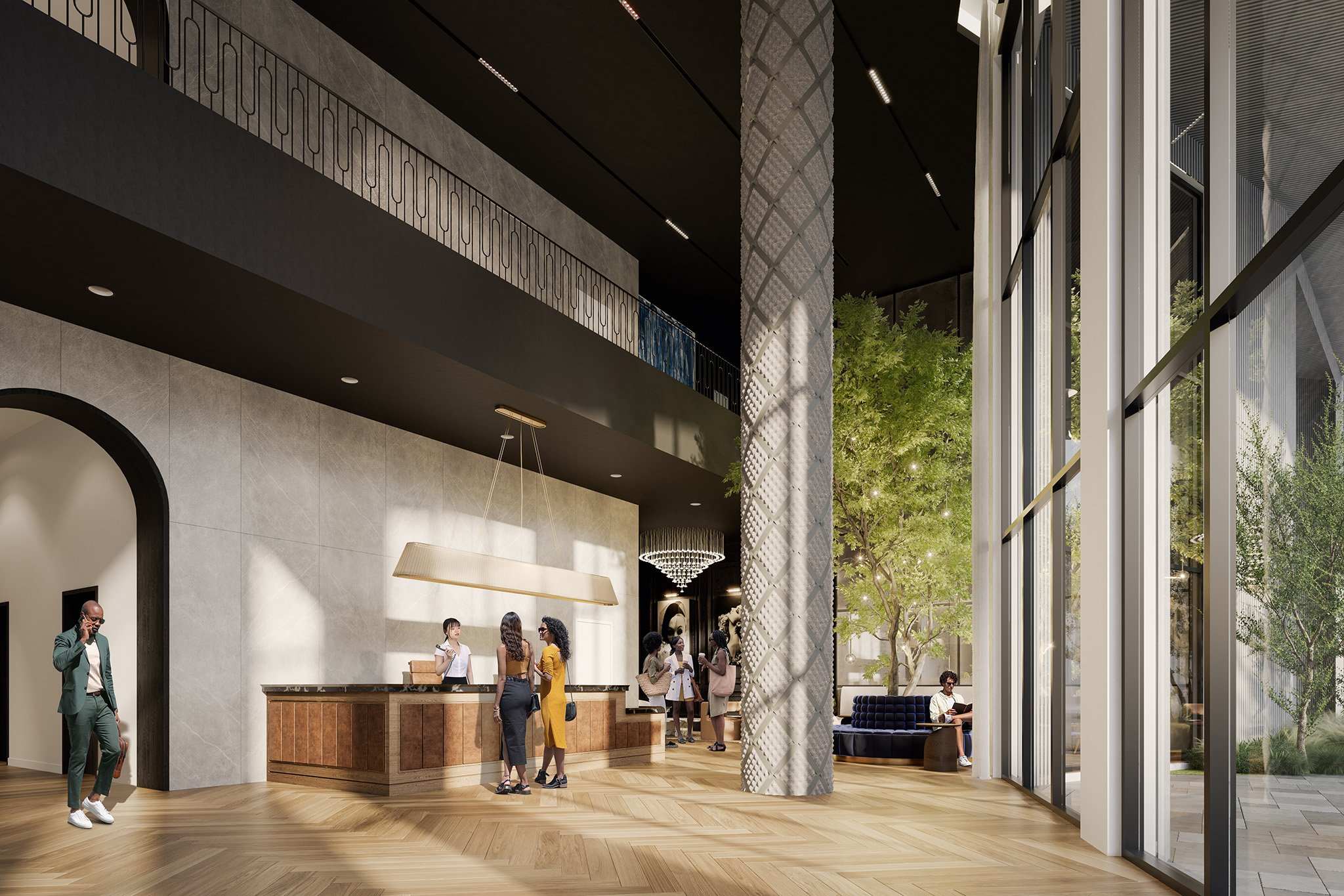
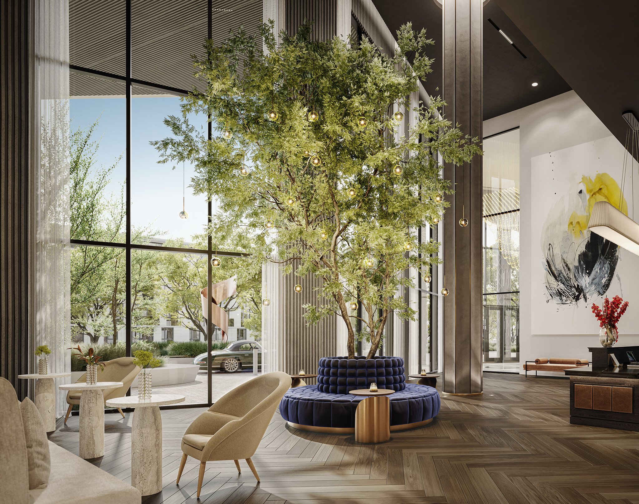
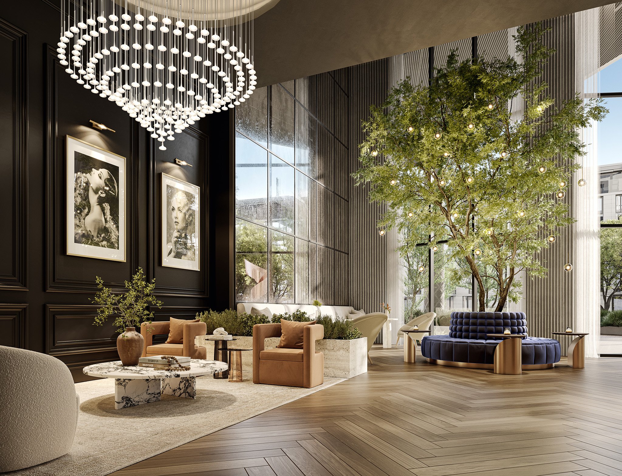
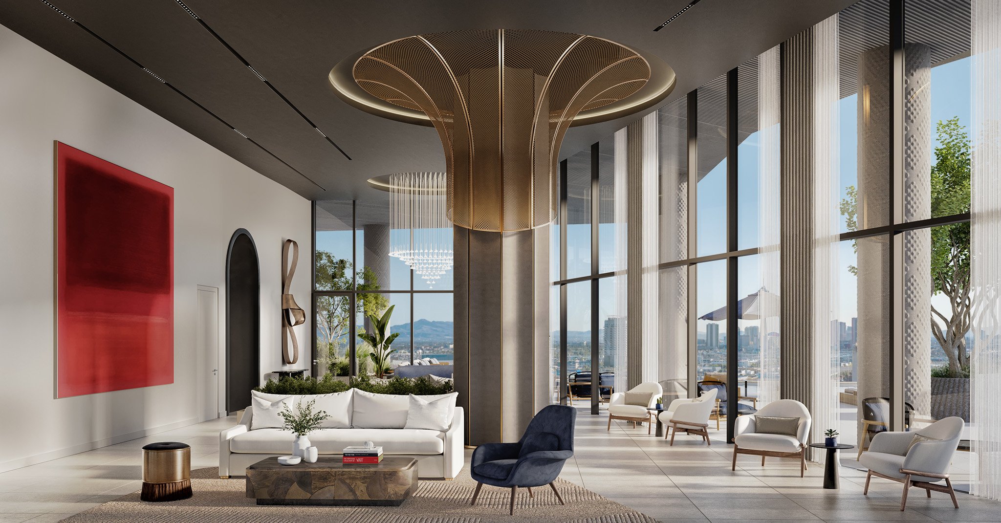
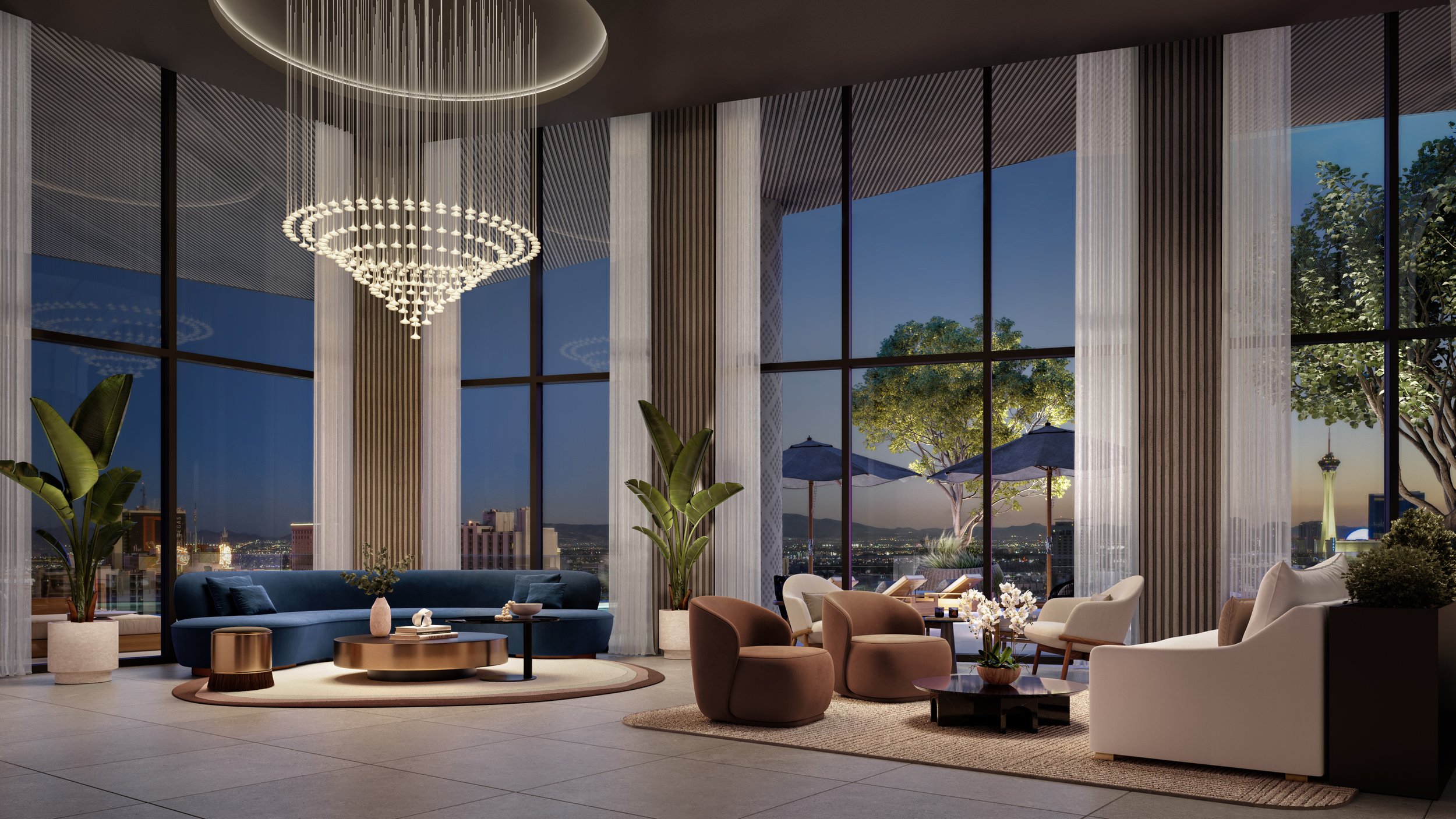
In the specialized field of architectural visualization, each project requires a unique approach and meticulous attention to detail. We are proud to present our first case study, which delves into one of our notable projects – Origin at Cello Tower in Las Vegas. This project was an opportunity for us to demonstrate our capabilities in delivering high-quality visualizations under pressing deadlines.
Charged with the task of producing detailed interior and exterior renderings and animations, we were approached by Susan LeFleur from One Line Design. The objective was clear: to accurately and effectively represent the elegance of Origin at Cello Tower, meeting the high expectations set by our client for their imminent project launch. This case study offers an insight into our strategic process, teamwork, and the practical solutions we employed to achieve this goal.
Navigating Tight Deadlines and High Expectations
At Darkroom, we understand that the true test of our expertise is not just in creating stunning visuals, but also in how we handle demanding situations. The Origin at Cello Tower project brought exactly this kind of challenge to our doorstep. With the project's launch date rapidly approaching, our client realized their existing renderings did not capture the essence of their vision. They needed a team that could deliver high-level architectural visualizations within a very short timeframe.
This is where our collaboration began. Susan LeFleur from One Line Design reached out to us with a critical request: to produce renderings and animations that would not just meet but surpass their expectations. The complexity and scale of the project required us to adapt our usual workflow and strategize effectively to meet these demands. It was a task that tested our ability to balance quality with efficiency, a hallmark of our studio's reputation.
Strategizing for Success Under Pressure
Faced with the intricate demands of the Origin at Cello Tower project, Darkroom needed to innovate and adapt. Our approach was twofold: redefining our workflow to accommodate the project's scale and complexity, and fostering seamless collaboration among diverse expert teams.
Firstly, the usual workflow was recalibrated to optimize efficiency without compromising the quality of our visualizations. This involved streamlining communication, enhancing our project management techniques, and deploying advanced tools tailored to the project’s specific needs.
Collaboration was key. The project brought together five specialized teams, each with a distinct role: Red Ridge as the developer with Patrick Brennan leading the charge, Perkins Eastman with Michael Friebele at the helm of architecture, One Line Design for interior design guided by Susan LeFleur, landscape design by Floor Associates, and the marketing team from Wicked, spearheaded by Colin and Brian Cooley. This multi-disciplinary approach allowed for a diverse set of perspectives and skills, all converging towards a singular vision.
Our strategy was not just about managing tasks; it was about creating an environment where each team could excel in their domain, ensuring all pieces of the project puzzle fit perfectly together.
Efficient Collaboration Leads to Timely Completion
The execution phase of the Origin at Cello Tower project was a period where Darkroom's commitment to delivering quality within tight deadlines truly shone. Our focus was on efficient project management and teamwork, ensuring that the client's vision was realized in a tangible and aesthetically pleasing manner.
Coordination between the teams was crucial. Red Ridge, under Patrick Brennan's guidance, provided essential development insights. Perkins Eastman, with Michael Friebele leading, focused on capturing the architectural essence. Susan LeFleur and One Line Design added depth to the interiors, while Floor Associates enhanced the overall appeal with their landscape designs. The marketing perspective was adeptly handled by Colin and Brian Cooley from Wicked, ensuring the project resonated well with its intended audience.
Throughout this phase, dedication and hard work were evident in every team member's efforts. The commitment to meeting the deadline was paramount, and everyone worked diligently to ensure timely delivery. This collective effort resulted in the successful creation of renderings and animations that accurately represented the elegance and sophistication of Origin at Cello Tower, delivered right before the project's launch.
Origin at Cello Tower: A Showcase in Prominent Publications and Media
The successful completion of the Origin at Cello Tower project has led to notable features in prominent publications and media outlets, highlighting the project's prominence and the quality of our visualizations.
Mansion Global, a respected publication in the real estate and luxury development sphere, chose to feature the project in their article on five luxury developments setting new standards in 2024. The inclusion of Cello Tower, particularly as the lead story and hero photo, underscored the project's significance and the appeal of our visualizations. It stood out as one of only two U.S. properties in the story, drawing attention to its unique qualities in a global context.
Additionally, the project garnered attention on a mainstream platform with a feature on Fox News. This exposure not only amplified the reach of the project but also highlighted Darkroom's role in bringing this vision to life through our architectural visualizations.
These media features are a reflection of the project's impact and the effectiveness of our work. We received positive feedback from our collaborators, with Brian Cooley from Wicked praising our timely and precise delivery: "Special shoutout to Darkroom's team for delivering these renderings so promptly and perfectly." Susan LeFleur also expressed her appreciation, saying, "Thanks so much for such a huge push." Such acknowledgments are valued as they demonstrate our commitment to excellence and client satisfaction.
Reflecting on a Milestone Project and Looking Ahead
As we conclude our first case study with the Origin at Cello Tower project, it's an opportune moment for reflection and forward-thinking. This project was not only about meeting a client's needs under a tight deadline; it was a demonstration of Darkroom's ability to handle complex tasks with efficiency, creativity, and collaborative synergy.
The successful completion of this project and its subsequent recognition in media outlets like Mansion Global and Fox News underscore our commitment to excellence in architectural visualization. It also highlights the importance of teamwork and the value of each partner's contribution to achieving a shared vision.
Looking ahead, Darkroom is excited to undertake more such challenging projects, pushing the boundaries of architectural visualization and continuing to deliver work that resonates both with our clients and the wider audience. Stay tuned for more case studies that showcase our journey, challenges, triumphs, and the evolving landscape of architectural visualization.
Thank you for joining us on this journey. We look forward to sharing more stories of innovation, collaboration, and visual excellence.

